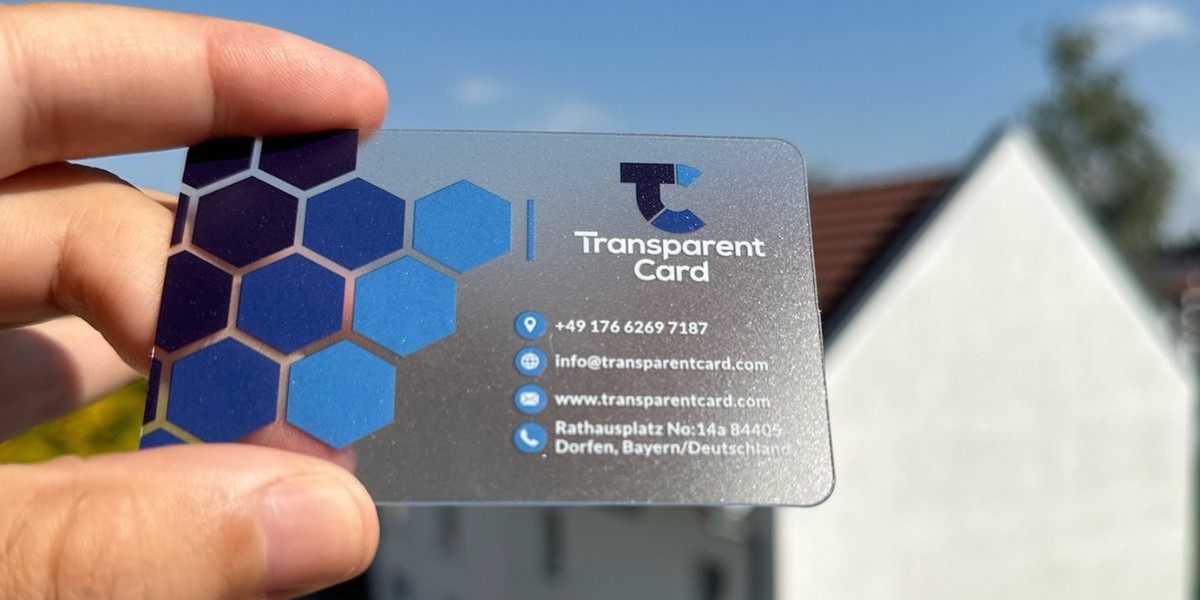
In this article, we’ll delve into the psychology behind different colors, explore how to select the right palette for your business card, and provide practical tips for effective color application.
The Role of Color in Business Card Design
Your business card is often the first impression of your brand. The colors you choose can communicate your brand’s personality, values, and industry. Since people form impressions in seconds, the right color combination can make your card memorable and help establish trust.
Key Psychological Effects of Color
Emotional Impact: Colors evoke emotions that influence how people feel about your brand.
Cultural Associations: Colors carry different meanings across cultures, which can affect their interpretation.
Brand Recognition: Consistent use of colors helps in reinforcing brand identity.
Attention-Grabbing: Bright and contrasting colors can make your business card stand out in a stack.
Exploring Color Psychology
Here is a breakdown of common colors used in business card design and their psychological associations:
1. Red
Psychological Effects: Red is associated with energy, passion, and urgency. It grabs attention and creates a sense of excitement.
Best For: Industries like food, entertainment, or sales-driven businesses.
Tips: Use red sparingly as an accent color to avoid overwhelming the design.
2. Blue
Psychological Effects: Blue conveys trust, stability, and professionalism. It is often seen as calming and reliable.
Best For: Corporate, finance, healthcare, and technology industries.
Tips: Pair lighter shades of blue with white for a clean and modern look.
3. Green
Psychological Effects: Green symbolizes growth, health, and harmony. It is often associated with nature and sustainability.
Best For: Eco-friendly brands, wellness, and financial services.
Tips: Combine green with earthy tones for a natural and grounded feel.
4. Yellow
Psychological Effects: Yellow represents optimism, creativity, and warmth. It’s an attention-grabbing color that evokes positivity.
Best For: Creative industries, hospitality, and children’s products.
Tips: Use yellow as a highlight color to draw focus to key elements.
5. Black
Psychological Effects: Black exudes elegance, power, and sophistication. It is timeless and versatile.
Best For: Luxury brands, fashion, and high-end services.
Tips: Pair black with metallic accents like gold or silver for a premium look.
6. White
Psychological Effects: White conveys simplicity, cleanliness, and purity. It creates a sense of openness and clarity.
Best For: Minimalist designs and brands emphasizing transparency.
Tips: Use white space strategically to balance other colors.
7. Purple
Psychological Effects: Purple is associated with creativity, luxury, and spirituality. It can evoke a sense of exclusivity.
Best For: Beauty, wellness, and premium services.
Tips: Opt for darker shades of purple to convey sophistication.
8. Orange
Psychological Effects: Orange signifies enthusiasm, energy, and friendliness. It is a bold and vibrant choice.
Best For: Startups, entertainment, and creative industries.
Tips: Balance orange with neutral colors to prevent it from being too overpowering.
9. Grey
Psychological Effects: Grey represents neutrality, balance, and professionalism. It is understated and versatile.
Best For: Consulting, technology, and corporate industries.
Tips: Combine grey with brighter accent colors for a modern look.
10. Pink
Psychological Effects: Pink is often associated with femininity, playfulness, and compassion. It can also convey creativity and warmth.
Best For: Beauty, fashion, and lifestyle brands.
Tips: Use soft pastels for a subtle effect or bold pinks for a vibrant appeal.
Choosing the Right Color Palette
Selecting the right color palette for your business card involves a combination of understanding your brand, audience, and design principles. Here’s how to approach it:
1. Define Your Brand Identity
Consider your brand’s mission, values, and personality.
For example, a law firm might lean towards blue for trustworthiness, while a creative agency might prefer yellow or orange for energy.
2. Know Your Audience
Think about the preferences and expectations of your target audience.
Cultural associations are particularly important if your business serves international markets.
3. Use the 60-30-10 Rule
Choose a primary color (60%), a secondary color (30%), and an accent color (10%).
This approach ensures a balanced and harmonious design.
4. Test for Contrast and Legibility
Ensure the text and graphics are easy to read against the chosen background colors.
High contrast between text and background enhances visibility.
5. Consider Industry Standards
While it’s good to stand out, staying within industry norms can help establish credibility.
For example, blue is a trusted choice in finance, while green is popular in health and sustainability sectors.
Practical Tips for Applying Colors
Focus on Simplicity: Avoid using too many colors, as this can make your business card look cluttered and unprofessional.
Incorporate Branding Elements: Use your brand’s existing color palette to maintain consistency across marketing materials.
Experiment with Finishes: Enhance your chosen colors with specialty finishes like foil stamping, spot UV, or embossing to add depth and texture.
Think About Paper Choice: The texture and color of your paper can affect how the printed colors appear.
Test Prints: Always review a physical proof to ensure the colors look as intended.
Conclusion
The psychology of color plays a crucial role in business card design, shaping how your brand is perceived and remembered. By understanding the emotional and cultural associations of different colors, you can create a design that resonates with your audience and aligns with your brand identity.
Whether you aim to exude professionalism, creativity, or luxury, the right color palette can make all the difference. Combine thoughtful color choices with a well-balanced design to ensure your business card leaves a lasting impression in every interaction.


